UX & UI design
Website Engagement Project
Website Engagement Project
I led my team to redefine web engagement and increased eShop click‑through rate by 54%
I led my team to redefine web engagement and increased eShop click‑through rate by 54%
Stages
Problem
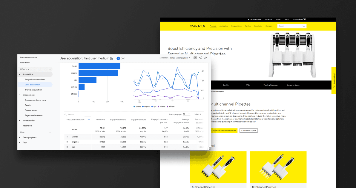
On paper, our engagement rate looked strong, but a deeper look showed that the most clicked element on key product pages was site search. Engagement rate alone told us that users were interacting with the page, but not whether they were finding what they needed or moving closer to a purchase.
In 2025, I was tasked with increasing web engagement across Sartorius LPS product marketing pages. I knew we needed a clearer definition of “engagement” and a better understanding of which actions truly signaled progress in the buying journey. Site search was a symptom that users were hunting for content that should have been obvious.
Problem
On paper, our engagement rate looked strong, but a deeper look showed that the most clicked element on key product pages was site search. Engagement rate alone told us that users were interacting with the page, but not whether they were finding what they needed or moving closer to a purchase.
In 2025, I was tasked with increasing web engagement across Sartorius LPS product marketing pages. I knew we needed a clearer definition of “engagement” and a better understanding of which actions truly signaled progress in the buying journey. Site search was a symptom that users were hunting for content that should have been obvious.
Strategy & approach
Strategy
I framed the project around a simple idea: understand what genuinely engages visitors and reshape our product pages experience around those behaviors. This was a great opportunity to involve the whole UX team, put our methods into practice, and align stakeholders around more meaningful engagement metrics.
Our strategy focused on three main steps:
Clarify purpose, goals, and deliverables for the project
Involve the full team through clear roles, timeline, and milestones
Redefine engagement in measurable terms tied to the buying journey
Approach
We used a mix of research methods to understand user behavior, validate assumptions, and turn insights into concrete page changes. The work combined qualitative input with analytics so we could confidently recommend updates.
Planning and setup included:
Defining project purpose, KPIs, and success criteria
Creating a timeline with milestones and assigning ownership across the team
Setting up tracking so we could compare behavior before and after changes
Research methods and insight‑gathering:
Customer proxy interviews: To better understand user goals, expectations, and pain points when landing on product marketing pages
New engagement KPIs: Moving beyond generic engagement rate to metrics like eShop link clicks and site search usage
Navigation best practices review: Looking at industry leaders to see how they support product discovery and purchase paths
On‑page experience review: Evaluating layout, content hierarchy, and visual cues on our own product pages
From there, we partnered with stakeholders to update content, revised on‑page design patterns, and monitored how those changes affected key metrics.

Figure 1. Screenshot of our Figma board as we collected web engagement best practices.
Strategy & approach
Strategy
I framed the project around a simple idea: understand what genuinely engages visitors and reshape our product pages experience around those behaviors. This was a great opportunity to involve the whole UX team, put our methods into practice, and align stakeholders around more meaningful engagement metrics.
Our strategy focused on three main steps:
Clarify purpose, goals, and deliverables for the project
Involve the full team through clear roles, timeline, and milestones
Redefine engagement in measurable terms tied to the buying journey
Approach
We used a mix of research methods to understand user behavior, validate assumptions, and turn insights into concrete page changes. The work combined qualitative input with analytics so we could confidently recommend updates.
Planning and setup included:
Defining project purpose, KPIs, and success criteria
Creating a timeline with milestones and assigning ownership across the team
Setting up tracking so we could compare behavior before and after changes
Research methods and insight‑gathering:
Customer proxy interviews: To better understand user goals, expectations, and pain points when landing on product marketing pages
New engagement KPIs: Moving beyond generic engagement rate to metrics like eShop link clicks and site search usage
Navigation best practices review: Looking at industry leaders to see how they support product discovery and purchase paths
On‑page experience review: Evaluating layout, content hierarchy, and visual cues on our own product pages
From there, we partnered with stakeholders to update content, revised on‑page design patterns, and monitored how those changes affected key metrics.
Figure 1. Screenshot of our Figma board as we collected web engagement best practices.
Key insights
Through our research and analysis, three insights stood out:
1) Anticipatory design is key to engaging users
Users are most engaged when their needs are anticipated before they arrive. That means understanding who they are, what they want to accomplish, and surfacing the right content at the right time. If we design for specific stages of the buying journey, users are less likely to resort to site search.
2) Immediate product imagery builds “information scent”
When users are looking for products, they rely on clear visual cues to confirm they are in the right place. Product imagery, category visuals, and clear product labels give them the “information scent” they need to move forward confidently. Without these cues, they feel lost, even if the content is technically present.
3) Long introductions set the wrong tone for product pages
As marketers, it is tempting to start with a long story about the “why” behind a product. In practice, users often arrive with a specific goal and limited time. If they land on a product marketing page and do not immediately see product categories, eShop links, or a clear product hero image, they assume they are in the wrong place. Long introductions and secondary content (promos, news, etc.) push critical content down, which leads to exits or a quick jump to site search.

Figure 2. Screenshot of Figma board used to synthesize gathered data into insights.
Key insights
Through our research and analysis, three insights stood out:
1) Anticipatory design is key to engaging users
Users are most engaged when their needs are anticipated before they arrive. That means understanding who they are, what they want to accomplish, and surfacing the right content at the right time. If we design for specific stages of the buying journey, users are less likely to resort to site search.
2) Immediate product imagery builds “information scent”
When users are looking for products, they rely on clear visual cues to confirm they are in the right place. Product imagery, category visuals, and clear product labels give them the “information scent” they need to move forward confidently. Without these cues, they feel lost, even if the content is technically present.
3) Long introductions set the wrong tone for product pages
As marketers, it is tempting to start with a long story about the “why” behind a product. In practice, users often arrive with a specific goal and limited time. If they land on a product marketing page and do not immediately see product categories, eShop links, or a clear product hero image, they assume they are in the wrong place. Long introductions and secondary content (promos, news, etc.) push critical content down, which leads to exits or a quick jump to site search.
Figure 2. Screenshot of Figma board used to synthesize gathered data into insights.
Solution
Core engagement pillars
Based on these insights, we focused on three core solution pillars:
Broaden the definition of engagement
Anticipate user needs for specific stages of the buying journey
Provide a clear, visual navigation path to products and the eShop
Optimized navigation & content experience
We updated a series of product marketing pages with:
Clear, prominent product imagery and category sections above the fold
Streamlined introductory copy that gets to the point quickly
More visible and intuitive paths to the eShop for users ready to buy
Content layouts aligned with navigation best practices and user expectations
KPI tracking
To measure success, we tracked changes in:
eShop product link clicks (as a positive engagement signal)
Site search usage on those pages (as a signal of friction)
Solution
Core engagement pillars
Based on these insights, we focused on three core solution pillars:
Broaden the definition of engagement
Anticipate user needs for specific stages of the buying journey
Provide a clear, visual navigation path to products and the eShop
Optimized navigation & content experience
We updated a series of product marketing pages with:
Clear, prominent product imagery and category sections above the fold
Streamlined introductory copy that gets to the point quickly
More visible and intuitive paths to the eShop for users ready to buy
Content layouts aligned with navigation best practices and user expectations
KPI tracking
To measure success, we tracked changes in:
eShop product link clicks (as a positive engagement signal)
Site search usage on those pages (as a signal of friction)
Outcome
After 90 days, I ran an impact report on the Multichannel Pipettes product marketing page (Figure 1), one of our primary test pages. The data validated the work and showed a clear shift from “searching” behavior to “action” behavior. As we rolled similar changes across other product pages, we saw the same pattern repeat.
Explore the Sartorius Multichannel Pipettes page
These changes indicated that users were finding relevant content more quickly, feeling confident they were in the right place, and moving more directly toward the eShop instead of relying on search as a fallback.
I was very proud of the results:
58.4
Increase in clicks to eShop product pages
60.3%
Decrease in visitors using site search
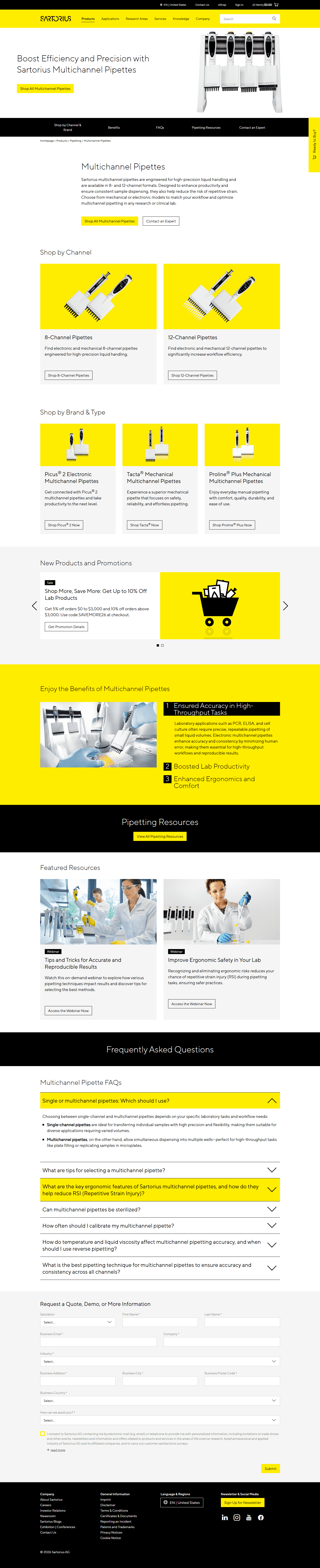
Figure 1. Screenshot of the new Multichannel Pipettes page.
Outcome
After 90 days, I ran an impact report on the Multichannel Pipettes product marketing page (Figure 1), one of our primary test pages. The data validated the work and showed a clear shift from “searching” behavior to “action” behavior. As we rolled similar changes across other product pages, we saw the same pattern repeat.
Explore the Sartorius Multichannel Pipettes page
These changes indicated that users were finding relevant content more quickly, feeling confident they were in the right place, and moving more directly toward the eShop instead of relying on search as a fallback.
I was very proud of the results:
58.4
Increase in clicks to eShop product pages
60.3%
Decrease in visitors using site search
Figure 1. Screenshot of the new Multichannel Pipettes page.
Nicholas Fargher
© 2026 Nicholas Fargher
Nicholas Fargher
© 2026 Nicholas Fargher